Pages

Tuesday, January 31, 2012

COMMIT TO COLOR ~ If you dare!


With all the fantastic paint colors out on the market, why is it that many insist on sticking to white and neutral colors?

Is it the fear of having a color 'forever' ? I've heard it all:  I like 'simple', I like 'minimal', I like 'traditional classic' beige! All of these are really just excuses because we are afraid, afraid to commit to color.
Let me spell it out for you.. painting a room will cost less than your leather handbag. For a couple of hundred bucks you can refresh, revitalize and restyle your space. With a hit of a paintbrush you will change your mood and reinvent your room. What is the worse that can happen, repainting back to safe old Magnolia?
But what if you love it, which you WILL (because life needs brightening up sometimes) you will be happy and in turn everyone will be happy. Remember the saying 'A happy wife = a happy life"

Choosing colors are hard, I admit. But I'm here to help and happy to answer any questions you may have. (Just leave a comment below or send me an email)
Let me break color down for you, keeping it simple... Stay with me, and finally grasp the basics of color that perplexes most of us. I will help you feel confident enough to discuss and choose colors like a Pro.
Newton's Color Wheel comprises of 12 colors

Primary Colors
Secondary Colors
(Result of mixing Primary colors together)

Tertiary Colors
(Result of mixing a Secondary with the Primary next door)

All color schemes derive from the above colors and color formations:

MONOCHROMATIC scheme is one color used in varying degrees whether it is black to grey to white or various shades of pink or yellow..

COMPLIMENTARY ~ For high contrast pick two colors from the opposite side of the wheel, this creates a balance of opposites where a cool color works with a warm color.

ANALOGOUS ~ Choose two to six colors that sit next to each other on the wheel.

TRIAD ~ For a bold but balanced scheme pick three equidistant colors from the wheel.

Colors have varying depths or HUES. A Hue is a pure color,so  by adding white to a color you create a tint, add black and you get a shade and grey for a tone. 


Now we have covered the basics, how do you choose what color choice is good for your home?

If your room gets little natural light and looks dark, cool colors would be a good option. Cool colors are blues and greens. Think ocean and sky, both evoke calm and tranquility.
If your room leaves you cold, you may want to lean towards warm colors, reds and oranges. Think summer sunset..warm and cozy feeling.

Whether you are brave enough to go bold and paint an entire room or not, the addition of cool or warm colors can be introduced in accents or soft furnishings, bed covers, cushions, throw blankets, rugs or lamp shades.

Do you have an influential color in your room? A carpet or heirloom rug, sofa or curtains? Picking out a color from one of your existing furnishings may be your 'lift off'. You can then decide how you want to approach color.

A Monochromatic scheme is one of the easier schemes to work with, however it needs to be executed correctly. To avoid it turning out 'flat', pick your color and use at least 3 different shades, I would recommend including a different color as an accent to create more interest. Also introducing texture is vital to a successful monochromatic interior, as is lighting.

Maybe you would prefer a dramatic Complimentary color scheme (Color from the opposite side of the wheel), I would recommend you let one color be the more dominant and accessorize with the other.

Many designers including myself  find a piece of fabric or painting that the client loves and base the entire color scheme off of it, this is a great way to plan colors and ensure a well put together room.

Here are some images showing the different color combinations.

Warm Monochromatic Lounge in Fuscia
This very unique lounge/guest room in a range of pinks just rocks! Its the room everybody loves to look at but is afraid to do! I would love to design this scheme for a gutsy client, anyone out there willing to let me transform their magnolia into magical?

Cool Monochromatic bedroom design in Blue
I can vouch for this monochromatic blue color scheme, I had a very similar design in my home in London, some people are not convinced about cool colors for the bedroom. For me it invokes peace and calm. Coupled with fresh white linens, shiny wood floors for contrast and a warm neutral rug, this room is very appealing, what do you think?

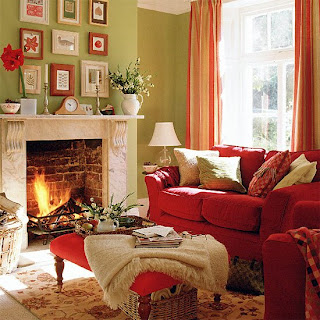
Complimentary colors Red & Green
This is traditional living room is a perfect example of a complimentary color scheme, using a near pure red hue on the furniture and a saturated green on the walls. The neutral colors of the fireplace and the flooring keeps it earthy and inviting.

Yellow ~ Green ~ Blue Analogous scheme
Using three colors located next to each other on the color wheel, this analogous scheme mixes yellows, greens and blues in this eclectic and cheerful sitting room. The dark floors and furniture ground the design. As I mentioned  earlier, the best way to make this scheme successful is to select one main color; tones of yellow in this case and use the other two colors as accents.

Triadic color scheme Purple~Orange~green

Full of energy and fun! This room is not for the faint of heart; the green paint chosen for the wall is very bold, but in combination with the purple sofa and orange cushions it works, and that is the beauty of learning how to use the color wheel. There is a formula that if executed correctly is a winning combination.

I hope you enjoyed my post and as a result are a little more confident about choosing color for your home.
Will you commit to color?
~D~

For questions on this post or to hire Dionne Designs for your home email dionnetrifirodesignllc@gmail.com


Saturday, January 28, 2012

Getting the LOOK! ~This is not what I ordered!

Image courtesy of West Elm

Your furniture has arrived and it looks great, but there is something missing. It doesn't look like it did in the magazine.
Wonder why? First of all Styling for a photo shoot is intense! There is the interior designer who had the vision, professional stylers with a myriad of accessories at their disposal, photographers with their lighting assistants, a director, editor etc..

seangphoto.com

Achieving the Look in your own home is not that simple!

Don't despair, lets figure out how to get it right.
I like to take a photo of the piece of  furniture including the whole area/wall behind it: Looking at a photograph helps alienate all the other items in the room and helps focus on one area without getting overwhelmed.

What do you see?

  • Is the furniture blending in with the wall?
  • Does it look too small? 
  • Does it look dark?
  • Does it look bare?
Be open to taking new directions. If the furniture is blending in with the wall, consider painting the wall a bright and cheerful color, you do not necessarily need to paint the whole room, just an accent wall. Or use some funky wallpaper http://bit.ly/y4xGn7 . You could hang an over sized mirror or colorful artwork as a backdrop whilst at the same time adding interest and drawing the eye to the furniture.

Photo courtesy of House Beautiful

If the furniture you bought is too small for the space? Add width by placing something on either side, tall plants or a pair of chairs. Go asymmetrical for a more casual approach.

Symmetrical Arrangement ~ Photo courtesy of House Beautiful
Asymmetrical Arrangement  ~ Photo courtesy of House Beautiful

Too dark? Lighting is key! A pair of wall sconces on either side of your artwork/mirror, a table lamp or floor lamps will brighten up and change the whole feeling of the space.
Finally, don't leave it bare! After positioning all the larger items (chairs, lamps etc..) visit your local Pottery Barn or West Elm stores for 'Designer' accent pieces.
It's now time to think about adding some decorative items to the mix. It is a great opportunity to add color without commitment! I like to group smaller items in 3's, one larger piece on its own for effect, and don't forget a family photo!

Orbs ~ West Elm

 Collection of Silver & Glass  ~ Pottery Barn


You can also use these tips to breath new life into a tired room. you don't have to spend a lot of money to get the look. Take cue from interior design magazines and consider hiring a professional!

Have a fabulous weekend!
~D~


If you would like to engage Dionne Designs for your home project send me an email at dionnetrifirodesignllc@gmail.com

Wednesday, January 25, 2012

From London to Brooklyn ~ Fabulous Wall Coverings

Interior Design Magazine showcased the 10 top products of  Maison et Objets 2012 this week, and whilst there were some fantastic products, my mind kept going back to Tracy Kendall, a fellow Brit from London who's vision and textural approach to wall coverings is genius.

For the 2012 Maison et Objets home show Tracy launched a new paper 'Drapes' and also injected color into her already fabulous Sequence Collection with the color line 'Tutti Frutti'.


    Tutti Frutti

    Drapes

Intrigued, I ventured onto her website and discovered many delights of which some I had not seen.
I feel in love with Pink Sequence and can imagine it in a lounge, ladies dressing room or bedroom. It would also be fabulous in a nursery, maybe a little extravagant, but nothing wrong with that ;)


I also loved the romanticism of her Text Collection, 'Midsummer's Night Dream' and 'From the Heart' are heartwarming.
To view to full collection got to www.tracykendall.com

Another company that has me returning to its website again and again is Flavor Paper, a company originally founded in Oregon is based in Brooklyn, NYC. Their approach to wall coverings i  hand screening and digital.
Their 'Flavor Lair' in Brooklyn won The Best Showroom of the Year 2010 by Interior Magazine.

Cry Wolf ~ 40' Digital mural designed by Heather Ujiie.

Flower of Love ~ Hand Screened

Bananas~ Designed by Michael Angelo is for kids or for fun

visit www.flavorpaper.com for tons more fun and original wall coverings.

Hope you enjoyed this midweek inspiration!
~D~


For more information on hiring Dionne Designs for your project email dionnedesignllc@gmail.com


Sunday, January 22, 2012

And the Golden Globe goes to ~ White Kitchens {in Movies}

The White Kitchen has been all the rage for a few years, and even with designers trying to 'Move On' the White Kitchen lives on. I know that are going to have to drag The White kitchen out of magazines and our lives kicking and screaming..

Big Blockbuster Movies have promoted this design phenomenon and working in Manhattan proximity very close to the Hamptons made me and many other designers I am sure target for this question...

"I don't know if you know what I talking about, but I want the same kitchen as in the movie Something Gotta Give. You know the one? The one with Jack Nicholson?" 

Yes, I do... oh yes, I know it well. I must have designed at least two dozen irregardless of the size, shape and budget of kitchen! I must admit, I still love this style and was fortunate to have worked with two of the three companies that without doubt do The White Kitchen the best in the industry.
So without further ado..

Here are the Nominees for The White Kitchen In Movies ~

Somethings Gotta Give
{Starring inset doors, glazed upper cabinets, SubZero refrigerator and dual islands}


Sex In The City 2 {Charlottes' Kitchen}
{Starring overlay doors, subway tiles, Wolf Range and Corian countertops}


Father Of The Bride
{Starring wood countertops, pot rack and mullioned glazed cabinets}


He's Not That Into You
{Starring wall mounted brass faucet, brass monkey lip pulls, and tiled countertops}


The Holiday
{Starring feature fireplace, not really white cabinets ;) and  porcelain knobs}


Life As We Know It
{Starring wall oven & microwave combo, stainless steel backsplash and prep sink in island}


The Break Up
{Starring butcher block island, antique step ladder and wall of glazed upper cabinets}


And the winner is.....(drum roll).... Father of the Bride, for authenticity and charm!

Which is your favorite?
~D~

For more information on hiring Dionne Designs for your design project contact me at dionnedesignllc@gmail.com :)

Friday, January 20, 2012

House Beautiful & Other Publications ~ 3 Featured Projects

My friends and colleagues have asked me to share some of my work, so here goes :)

HOUSE BEAUTIFUL ~ Kitchen of the Month

This Long Island estate was built in 1913, a gorgeous house with beautiful landscaping and immaculate interiors. The kitchen however was small and crammed and had a chimney smack in the center of the room similar to a traffic circle, with cabinets built awkwardly around it.
I worked with the contractor to remove the chimney all together, and took over the 'exercise room' next door which we turned into a mudroom/flower room. Another factor to contend with was a low ceiling height, I took the attention off this by bringing the cabinets to the ceiling and painting the ceiling a fresh white.
The result as I hope you will agree is a bright functional and beautiful room where the family spend most of their time together.


Pin It I designed dual islands in the main kitchen area (in the foreground) in Natural Oak, with hard wearing and good looking CaeserStone countertops. Pan drawers, a Wolf Range with Pot Rack filler and Wolf vent above, SubZero Pro Refrigerator are some of the features in this part of the layout.
The Mud Room can be seen in the background.


Pin It The Mud Room has direct access from the garden, it houses some additional storage and refrigeration, and a pull out pantry. One drawer for outfitted and sized specially for incoming and outgoing mail with dividers for stamps and other related items. The lift up bench/island sits in front of a large storage cabinets (not seen) which houses outdoor wear, sport equipment and even a compartmentalized drawer for sunglasses!


Pin It The second island also serves as a Breakfast Bar, with coffee machine and TV which can be hidden away behind the stainless steel tambour rolling door. A gorgeous duck egg blue hand painted china cabinet gives gentle reprieve to the otherwise neutral tones.
(Not seen is a large round pedestal antique breakfast table with built in bench seating with an intricately detailed spindle back)


Pin It I find that using unfitted furniture gives the illusion of space and adds interest to the overall scheme. The Pot Board Dresser topped with white marble is placed under the window. Apart from being a conversational point the client is an avid baker and so it is perfect for her and her children who enjoy helping. They can even reach at the kid friendly lower level!


Pin It Love these Limestone Flooring I chose from Paris Ceramics USA, ask for Lorraine Valenti at the A&D Building in NYC.


Pin It Large Franke pot filler faucet is perfect for filling buckets of flowers, clean sports equipment and wash muddy boots. 


Pin It The Natural Oak plate rack is filled with everyday dishes and glassware which make for easy access and good looks too! Glass back splash tiles from Waterworks.

For full feature including my interview by Christine Pittel go to:

GOTHAM MAGAZINE

This Maple and exotic Masur Birch kitchen was a Town House kitchen project in downtown Manhattan. This project had challenges: It was very narrow and very long.
We went for no clutter, clean lines with top notch quality woodwork and unusual grey toned Sienite Monchique granite countertops. We let the timber speak for itself, opting out for any decorative hardware and adding detail reflected in the serpentine curved drawers.

HOUSE & GARDEN UK


Moving country is hard work, designing and installing a very large and detailed kitchen, breakfast area and butlers pantry across the waters is challenging!
This lovely family originally from San Francisco, moved to the Upper East side Manhattan before making the big move to London. Having spent the last 15 years in London and knowing the product first hand made me the lucky candidate for this kitchen renovation.

As to be expected, space on House & Garden magazine is at a huge premium and the article is about the entire house renovation, so I was overly flattered to have an image included!
The kitchen is full of detail and there is even an office space for the family's PA inside the butlers pantry! So even though the image does not show too much detail in any case, as you can imagine I was over the moon.
I was ecstatic to get to specify a top of the line, utterly divine La Cornue Range Cooker! Organised in top fashion despite time differences, by the appliance department at Harrods.
The cabinets are a simple shaker style in white with a recessed mirror kicker that gives the impression that the island is floating. The pale blue walls are welcoming and the old fashioned stools add an eclectic feel and were purchased locally.

I hope you enjoyed some of my work and I would love to know you've visited so please sign in or leave a comment. :)

For information about hiring me for your design project contact me at dionnetrifirodesignllc.com

Have a stylish weekend!
~D~


Pin It

Thursday, January 12, 2012

How you can get the look! PART 2 ~ART TAKING CENTER STAGE~

I really didn't mean to showcase three Master Painters in the last post, it just happened. Things seem to go that way with blogging, as the research gains momentum you never know where that snowball is going to land.
As soon as the works of Picasso, Moore and Monet 'made their way' into the post the rest faded away. I reacted pretty much in the same way I had reacted on seeing these artists work in person, speechless with mouth agape, somewhat unattractive, for me that's really saying something... the speechless part I mean ;) ... I digress.

So I decided that I am going to make it up to you!
In this post I want to show you ideas that don't need zillions of dollars to do and which can create a visual impression. Through a thoughtful combination of postioning, lighting, scale and composition, affordable artwork can take center stage.


Image via Apartment Therapy. Vintage chic  ~ Hung in a seemingly haphazard way, this art collection shows a mixture of framed and frame less art on a brilliant white painted wall.


This image via  http://www.decorchick.com shows a series of pictures hung in well planned order, forming a clean rectangular shape. All the frames are white and the pictures themselves are mounted on white card. This creates a clean contemporary feel in an otherwise classic chic living room.


Image via Apartment Therapy. These series of brightly colored circles are mounted on a no frills white background and are framed in a light colored wood. This gives a fresh and modern almost Scandinavian look to this children's room.


Image via Apartment Therapy. The red painted accent wall sets off  the white grid map which takes center stage in this living room.


I love this crafty picture, it is a series of pinned tickets, it not only gives a great color sense but is also tactile, and is a great way to showcase a collection.


Jan Eleni


Jan Eleni


MY FAVORITE! Collage work by Jan Eleni, introduced to me by Robert Novogratz of http://thenovogratz.com

The two images above are a series of photographs of your child's artwork, miniaturized and made into this amazing art work! Again the white on white leaves nowhere for the eye to wander and keeps you focused on the paintings created by your little ones and preserved in such a fantastic and artistic manner by Jan Eleni.

Till next time.
~D~