I must say I've had a lot of fun! So thank you for your questions. For those who did not make it on the blog, I will continue to answer via email.
Jamie's kitchen, breakfast room and family room is my final Design Dilemma, here is her dilemma.
Design inspiration: we have a rectangular space that our Kitchen and Family room occupy. Between these spaces is a large island which contains our fireplace. I am looking for inspiration for an updated kitchen dinette area (cabinets are cherry and table is currently a matchy-matchy cherry) to integrate into (also) a refreshed FR area. I wanted to freshen up the space for my young family of 4: darker/lighter table, fun chairs (maybe a couple upholstered?) So lost and would love your thoughts!
What a gorgeous home!
The first thing I see is the fab ceiling and classic architectural details, the room has great bones, it seems weird to me that with all the windows, high ceilings and open concept that the room looks so dark and dull. This is not a reflection of your young family!
As in most projects lets begin with 'demo'. The TV cabinet, both rugs and the dining set need to go.... Budget permitting, we can look at new sofas.
First off the walls are too dark, the grey is just bringing in a rainy day. We need to choose a light and bright wall color, lets bring in a clear blue sky...carry the paint through into the kitchen and include the island.
 |
| Willard White by Benjamin Moore |
I adore Willard White, it is a soft neutral with a hint of sky! You may choose to dd a little more color...
 |
| Grantham Blue by Benjamin Moore |
I was discussing this post on Twitter with @ShelleyHolmes Follow Shelley HERE and @FifthWallDesign Follow Diana HERE . Diana who is an Interior Designer based in Virginia mentioned linking the dividing wall to the ceiling, after a few back & forth this is the very sketchy sketch of the result, I think it grounds the wall, which otherwise looks detached, do you agree?
Replacing the wood media unit in the family room with a built in arrangement similar to the image below will totally transform the area and create good storage, with plenty of charm.
 |
| Via DecorPad |
Back to the kitchen area where the breakfast area is somewhat tight. Chairs actually take up a lot of space, so my idea for seating would be to design a bench which will back to the dividing wall! The tiles would be covered with a paneled back and adding cushions will make a comfy place to hang out. There is no doubt that kids love banquettes (and so do I! Check out over 70 different Banquettes here: http://pinterest.com/dionnetrifiro/kitchen-banquettes-benches/ ;)
Here is a freestanding bench idea: Love the rattan chair too!
 |
| http://pinterest.com/pin/234750199296739491/ |
 |
| http://pinterest.com/pin/234750199297007806/ |
It would be lovely if the table was a washed out pine farmhouse style or a simple white one which would carry the white through the space.
 |
| http://pinterest.com/pin/234750199296908478/ |
I think this table would look great and I love the 2 upholstered chairs and the white lantern.
 |
| http://pinterest.com/pin/220746819205576773/ |
 |
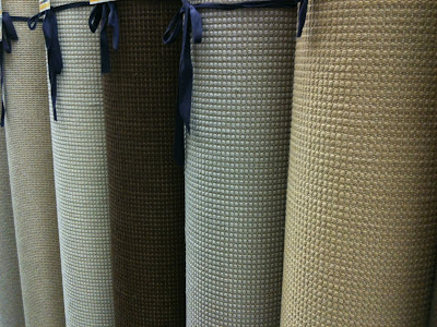
| Worldwide Wholesale Floor Coverings |
I saw a fantastic curtain today which inspired me to choose these fabrics. The family room really needs softening and whereas we do not want to have the curtains close off the light, some panels in between each window will make a huge difference!
 |
 |
| All fabrics available at Calico Corners |
Jamie, hopefully I have inspired you and my readers today to make something beautiful!
~D~
For info on any of the above products contact me on dionnetrifirodesignllc@gmail.com


Love the color scheme and fabrics! Great kitchen layout.
ReplyDeleteHi Maribel,
DeleteThe kitchen is existing, and yes the layout is okay! We are working toward a brighter and more cheerful color scheme and younger furniture.
Thanks so much for reading.
~D~
Such fun ideas, and great fabric choices. I love the banquette idea!! Thank you for sharing your inspiration!!
ReplyDeleteJamie! I'm glad you love it! Thanks for posting.. I really think the banquette idea is a great spot to get some fun fabrics in, and its super comfy for kids! The more I look at your kitchen I really think a white table and white lantern or other light fitting would be the best option. Remember the curtains don't need to cover the full width of the wall, use 2 wider panels in between each window, have them lined and pinch pleated. Ill talk to you more via fb message!
Delete