This is one of those times where I see a product and I shout out 'What took them so long!!
IdeaPaint have come up with an ingenious clear paint that transforms nearly any surface into a WHITE BOARD, isn't that just great?
I'm guessing its a clear lacquer of sorts.....lets investigate further~ According to IdeaPaint it's a clear top coat that can be applied to any dry paint surface or even wood, transforming any surface into a white board, or green board or an ORANGE wall if you fancy, or even your board room table!
Is it just me! Or do I hear the church bells ringing? My husband is giving me the "only you would get so excited about this" look... But I beg to differ, there are many did I say MILLIONS of design junkies out there who just like me will be placing an order for this revolutionary stuff.
For the hefty price of $225.00 which covers 50sq ft, it can be yours... here's the link
http://www.ideapaint.com/work/shop
Send in your pics!
~D~
Showing posts with label white. Show all posts
Showing posts with label white. Show all posts
Tuesday, May 22, 2012

Tuesday, March 20, 2012
7 Spring Colors For Your Kitchen
IT'S THE FIRST DAY OF SPRING!
Whether you are designing a new kitchen or renovating an existing one, the color of the walls is an important element which will have a big effect on the overall design.
Here are some things to keep in mind when choosing your colors.
~ Is the kitchen open plan to the rest of the home?
~ Does the kitchen get plenty or no natural light?
~ Is painting the existing cabinets an option?
~ Do not ignore the color of the cabinets, floors and back splashes, it all needs to work together!
~ Do you have to work around existing soft furnishings?
Below are some of my favorite spring colors and paint chips. I have included some great links from Benjamin Moore and Sherwin-Williams at the end of the post to help you along the way!
This fresh and inviting kitchen is mostly white, the apple green interiors sets off the white china beautifully. The green color is carried through onto the bench seat cushions in the dining area.
Nothing says Spring like yellow!
The walls are Benjamin Moore's Inner Glow. The table is a tangy citric lemon which if too bright for your tastes could also look nice in gray or white.
What do you think of this "Willy Wonka and the Chocolate Factory" inspired kitchen? The wall color ties in nicely with the checkered brown & white floor and with the accessories above the mantle.

Give your existing cabinets a new lease of life. Benjamin Moore's Dove White was used in this kitchen, and the walls are grass-green (source unknown).

Here is another green wall color although much paler by comparison. I find greens and blues to be very usable colors for the kitchen. Both these colors go equally well with dark and light wood alike.
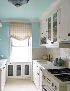
I love the way they extended the blue paint to the ceiling, it gives an airy feeling making this galley kitchen feel bigger.
Neutrals reign in this traditional kitchen. The cabinets and the walls are Farrow & Ball's Biscuit and the ceiling cornice and ceiling are painted Lime White also by Farrow & Ball.
When choosing paint, buy sample pots first and paint large squares in different parts of the room and study them at different times of the day in natural light and artificial light. It may be a good time to see what type of bulbs you are using, some give off a yellow light which will change the color of the walls substantially.
Benjamin Moore and other paint manufacturers have some online tools to get you started like the Personal Color Viewer (R) CLICK HERE!
See GREAT COLOR TIPS HERE from Sherwin-Williams on how to choose Interior Paint Colors.
Choosing colors is no easy feat and I would always recommend hiring a color consultant or interior designer to help you avoid costly mistakes.
I LOVE THIS TIME OF YEAR, SPRING IS THE TIME OF NEW BEGINNINGS, ENJOY YOURS!
~D~
Whether you are designing a new kitchen or renovating an existing one, the color of the walls is an important element which will have a big effect on the overall design.
Here are some things to keep in mind when choosing your colors.
~ Is the kitchen open plan to the rest of the home?
~ Does the kitchen get plenty or no natural light?
~ Is painting the existing cabinets an option?
~ Do not ignore the color of the cabinets, floors and back splashes, it all needs to work together!
~ Do you have to work around existing soft furnishings?
Below are some of my favorite spring colors and paint chips. I have included some great links from Benjamin Moore and Sherwin-Williams at the end of the post to help you along the way!
 |
| Designed by Architect Gil Schafer & color consultant Eve Ashcraft |
 |
| Benjamin Moore White Ice |
 |
| Benjamin Moore Apple Green |
 |
| Designed by Lindsey Coral Harper |
Nothing says Spring like yellow!
The walls are Benjamin Moore's Inner Glow. The table is a tangy citric lemon which if too bright for your tastes could also look nice in gray or white.
 |
| Benjamin Moore Inner Glow |
 |
| Benjamin Moore Gray Owl as an alternative color for the table. |
 |
| Jamie Gottschall's Pennsylvania Kitchen |
 |
| Benjamin Moore Chocolate Candy Brown |
 |
| Try Benjamin Moore Classic Brown for a deeper color |
What do you think of this "Willy Wonka and the Chocolate Factory" inspired kitchen? The wall color ties in nicely with the checkered brown & white floor and with the accessories above the mantle.

Give your existing cabinets a new lease of life. Benjamin Moore's Dove White was used in this kitchen, and the walls are grass-green (source unknown).
 |
| Benjamin Moore Dove White |
 |
| Benjamin Moore Pear Green |

Here is another green wall color although much paler by comparison. I find greens and blues to be very usable colors for the kitchen. Both these colors go equally well with dark and light wood alike.
 |
| Sherwin Williams Gleeful |

I love the way they extended the blue paint to the ceiling, it gives an airy feeling making this galley kitchen feel bigger.
 |
| Benjamin Moore Antiguan Skies |
 |
| Benjamin Moore Clear Skies |
 |
| Designed by Kathy Smith |
Neutrals reign in this traditional kitchen. The cabinets and the walls are Farrow & Ball's Biscuit and the ceiling cornice and ceiling are painted Lime White also by Farrow & Ball.
 |
| Farrow & Ball Lime White |
 |
| For an alternative to Farrow & Ball maybe try French Toast by BM , image via wendihiebert.com |
When choosing paint, buy sample pots first and paint large squares in different parts of the room and study them at different times of the day in natural light and artificial light. It may be a good time to see what type of bulbs you are using, some give off a yellow light which will change the color of the walls substantially.
Benjamin Moore and other paint manufacturers have some online tools to get you started like the Personal Color Viewer (R) CLICK HERE!
See GREAT COLOR TIPS HERE from Sherwin-Williams on how to choose Interior Paint Colors.
Choosing colors is no easy feat and I would always recommend hiring a color consultant or interior designer to help you avoid costly mistakes.
I LOVE THIS TIME OF YEAR, SPRING IS THE TIME OF NEW BEGINNINGS, ENJOY YOURS!
~D~
Tuesday, March 6, 2012
Upper East Side Kitchen Renovation
A happy client is the best reward.
I recently received these snapshots of a project I completed in Manhattan.
The renovation was extensive and walls came down and rooms had to be re invented. What you are seeing is the result of a long process including the expansion of the kitchen, restructuring of the existing fireplace, new ceilings, complete new lighting layouts, restoring the wood floors, the whole nine yards!
The result, a spacious calm and bright custom designed eat-in kitchen, planned with meticulous detail.
The client kindly sent a letter which was so nice that I 'Happy Danced' all around my living room :) I have included excerpts below, I just couldn't help myself!!
 |
| Directional lighting over the new fireplace and charcoal grey feature wall. Glass china cabinets are flanked by solid door dressers for additional storage and as a visual separation from the working kitchen area. Marble back splash and walnut counter top creates a warmer feel for dining. |
 |
| Choice of uplighting and under counter lights means the kitchen lights can be turned off whilst dining. |
 |
| Plenty of space for preparing meals. |
 |
| Fantastic Sub Zero combination which includes tons of refrigeration, wine fridge and freezer drawers. An easy access lower drawer is dedicated to childrens juices, yogurts and snacks. |
 |
| Walnut contrasts and marble complements the gorgeous hand painted cabinets. |
 |
| Stainless Steel dishwasher and appliance garage is flanked by a full height pull out pantry. |
 |
| Discreet custom colored glass back splash was manufactured in one single piece. Space is allocated to cooking books and trays. Full size pull out trash bin is concealed behind a custom door. |
 |
| There is a place for everything in this kitchen: Pot and pans, spices, cutlery and utensils are put away out of sight. Small appliances, cleaning products and recycling also have a spot in order to keep the counters clear and tidy. |
I am so thankful to work for such nice and generous clients, their kindness knows no bounds. This client went a step further and took the time out of her busy day to write a letter that makes all the hard work worth while. I would like to share some of it with you.
I had been attempting to redo my kitchen for about a year. My satisfaction level with other kitchen designers was quite low and I was beginning to reconsider going forward with the project. I visited the showroom one afternoon and was introduced to Dionne. Prior to creating any designs, Dionne met with me a number of times to understand our space, our needs, and our style.
When she presented the first design sketches, I was amazed at how she had incorporated everything we wanted into three beautiful alternatives. I have worked with other designers who have taken 5, 10, 20 times to get the design right. Dionne got it on the first try.
As we moved through the process Dionne showed immense patience with me, answered all of my questions, provided a number of alternatives and gave her opinion when I needed it. She made herself available to me at all hours.
When she presented the first design sketches, I was amazed at how she had incorporated everything we wanted into three beautiful alternatives. I have worked with other designers who have taken 5, 10, 20 times to get the design right. Dionne got it on the first try.
As we moved through the process Dionne showed immense patience with me, answered all of my questions, provided a number of alternatives and gave her opinion when I needed it. She made herself available to me at all hours.
During the construction process, I would write emails to the team and Dionne would always be the first one to answer me back. At one particularly frustrating point in the construction process, my husband and I were having a hard time choosing our floor stain color. Dionne answered my call while she was on vacation, suggested a few color alternatives, asked me to send her pictures of each stain sample after they had dried on the floor, and then guided us toward the color we ultimately picked.
Throughout the process, I felt that I was dealing with a friend that I could trust instead of with just another vendor.
In my humble opinion, Dionne is remarkably talented, has an amazing eye for color and design, and is fun and easy to work with. We love our kitchen and it wouldn’t have been this way without Dionne's help.
Jackie"
Wouldn't this be enough to brighten your day? For me, I've learned an important lesson and I will definitely be remembering to write my thank you notes.


Tuesday, January 31, 2012
COMMIT TO COLOR ~ If you dare!

With all the fantastic paint colors out on the market, why is it that many insist on sticking to white and neutral colors?
Is it the fear of having a color 'forever' ? I've heard it all: I like 'simple', I like 'minimal', I like 'traditional classic' beige! All of these are really just excuses because we are afraid, afraid to commit to color.
Let me spell it out for you.. painting a room will cost less than your leather handbag. For a couple of hundred bucks you can refresh, revitalize and restyle your space. With a hit of a paintbrush you will change your mood and reinvent your room. What is the worse that can happen, repainting back to safe old Magnolia?
But what if you love it, which you WILL (because life needs brightening up sometimes) you will be happy and in turn everyone will be happy. Remember the saying 'A happy wife = a happy life"
Choosing colors are hard, I admit. But I'm here to help and happy to answer any questions you may have. (Just leave a comment below or send me an email)
Let me break color down for you, keeping it simple... Stay with me, and finally grasp the basics of color that perplexes most of us. I will help you feel confident enough to discuss and choose colors like a Pro.


(Result of mixing Primary colors together)

(Result of mixing a Secondary with the Primary next door)
All color schemes derive from the above colors and color formations:
MONOCHROMATIC scheme is one color used in varying degrees whether it is black to grey to white or various shades of pink or yellow..
COMPLIMENTARY ~ For high contrast pick two colors from the opposite side of the wheel, this creates a balance of opposites where a cool color works with a warm color.
ANALOGOUS ~ Choose two to six colors that sit next to each other on the wheel.
TRIAD ~ For a bold but balanced scheme pick three equidistant colors from the wheel.
Colors have varying depths or HUES. A Hue is a pure color,so by adding white to a color you create a tint, add black and you get a shade and grey for a tone.

Now we have covered the basics, how do you choose what color choice is good for your home?
If your room gets little natural light and looks dark, cool colors would be a good option. Cool colors are blues and greens. Think ocean and sky, both evoke calm and tranquility.
If your room leaves you cold, you may want to lean towards warm colors, reds and oranges. Think summer sunset..warm and cozy feeling.

Do you have an influential color in your room? A carpet or heirloom rug, sofa or curtains? Picking out a color from one of your existing furnishings may be your 'lift off'. You can then decide how you want to approach color.
A Monochromatic scheme is one of the easier schemes to work with, however it needs to be executed correctly. To avoid it turning out 'flat', pick your color and use at least 3 different shades, I would recommend including a different color as an accent to create more interest. Also introducing texture is vital to a successful monochromatic interior, as is lighting.
Maybe you would prefer a dramatic Complimentary color scheme (Color from the opposite side of the wheel), I would recommend you let one color be the more dominant and accessorize with the other.
Many designers including myself find a piece of fabric or painting that the client loves and base the entire color scheme off of it, this is a great way to plan colors and ensure a well put together room.
Here are some images showing the different color combinations.
 |
| Warm Monochromatic Lounge in Fuscia |
 |
| Cool Monochromatic bedroom design in Blue |
 |
| Complimentary colors Red & Green |
 |
| Yellow ~ Green ~ Blue Analogous scheme |
 |
| Triadic color scheme Purple~Orange~green |
Full of energy and fun! This room is not for the faint of heart; the green paint chosen for the wall is very bold, but in combination with the purple sofa and orange cushions it works, and that is the beauty of learning how to use the color wheel. There is a formula that if executed correctly is a winning combination.
I hope you enjoyed my post and as a result are a little more confident about choosing color for your home.
Will you commit to color?
~D~
For questions on this post or to hire Dionne Designs for your home email dionnetrifirodesignllc@gmail.com
Sunday, January 22, 2012
And the Golden Globe goes to ~ White Kitchens {in Movies}
The White Kitchen has been all the rage for a few years, and even with designers trying to 'Move On' the White Kitchen lives on. I know that are going to have to drag The White kitchen out of magazines and our lives kicking and screaming..
Big Blockbuster Movies have promoted this design phenomenon and working in Manhattan proximity very close to the Hamptons made me and many other designers I am sure target for this question...
"I don't know if you know what I talking about, but I want the same kitchen as in the movie Something Gotta Give. You know the one? The one with Jack Nicholson?"
Yes, I do... oh yes, I know it well. I must have designed at least two dozen irregardless of the size, shape and budget of kitchen! I must admit, I still love this style and was fortunate to have worked with two of the three companies that without doubt do The White Kitchen the best in the industry.
So without further ado..
Here are the Nominees for The White Kitchen In Movies ~
Somethings Gotta Give
{Starring inset doors, glazed upper cabinets, SubZero refrigerator and dual islands}


Sex In The City 2 {Charlottes' Kitchen}
{Starring overlay doors, subway tiles, Wolf Range and Corian countertops}


Father Of The Bride
{Starring wood countertops, pot rack and mullioned glazed cabinets}

He's Not That Into You
{Starring wall mounted brass faucet, brass monkey lip pulls, and tiled countertops}

The Holiday
{Starring feature fireplace, not really white cabinets ;) and porcelain knobs}

Life As We Know It
{Starring wall oven & microwave combo, stainless steel backsplash and prep sink in island}

The Break Up
{Starring butcher block island, antique step ladder and wall of glazed upper cabinets}


And the winner is.....(drum roll).... Father of the Bride, for authenticity and charm!
Which is your favorite?
~D~
For more information on hiring Dionne Designs for your design project contact me at dionnedesignllc@gmail.com :)
Subscribe to:
Posts (Atom)