With all the fantastic paint colors out on the market, why is it that many insist on sticking to white and neutral colors?
Is it the fear of having a color 'forever' ? I've heard it all: I like 'simple', I like 'minimal', I like 'traditional classic' beige! All of these are really just excuses because we are afraid, afraid to commit to color.
Let me spell it out for you.. painting a room will cost less than your leather handbag. For a couple of hundred bucks you can refresh, revitalize and restyle your space. With a hit of a paintbrush you will change your mood and reinvent your room. What is the worse that can happen, repainting back to safe old Magnolia?
But what if you love it, which you WILL (because life needs brightening up sometimes) you will be happy and in turn everyone will be happy. Remember the saying 'A happy wife = a happy life"
Choosing colors are hard, I admit. But I'm here to help and happy to answer any questions you may have. (Just leave a comment below or send me an email)
Let me break color down for you, keeping it simple... Stay with me, and finally grasp the basics of color that perplexes most of us. I will help you feel confident enough to discuss and choose colors like a Pro.
Newton's Color Wheel comprises of 12 colors
Primary Colors
Secondary Colors
(Result of mixing Primary colors together)
Tertiary Colors
(Result of mixing a Secondary with the Primary next door)
All color schemes derive from the above colors and color formations:
MONOCHROMATIC scheme is one color used in varying degrees whether it is black to grey to white or various shades of pink or yellow..
COMPLIMENTARY ~ For high contrast pick two colors from the opposite side of the wheel, this creates a balance of opposites where a cool color works with a warm color.
ANALOGOUS ~ Choose two to six colors that sit next to each other on the wheel.
TRIAD ~ For a bold but balanced scheme pick three equidistant colors from the wheel.
Colors have varying
depths or HUES. A Hue is a
pure color,so by adding white to a color you create a
tint, add black and you get a
shade and grey for a
tone.
Now we have covered the basics, how do you choose what color choice is good for your home?
If your room gets little natural light and looks dark,
cool colors would be a good option. Cool colors are blues and greens. Think ocean and sky, both evoke calm and tranquility.
If your room leaves you cold, you may want to lean towards
warm colors, reds and oranges. Think summer sunset..warm and cozy feeling.
Whether you are brave enough to go bold and paint an entire room or not, the addition of cool or warm colors can be introduced in accents or soft furnishings, bed covers, cushions, throw blankets, rugs or lamp shades.
Do you have an influential color in your room? A carpet or heirloom rug, sofa or curtains? Picking out a color from one of your existing furnishings may be your 'lift off'. You can then decide how you want to approach color.
A Monochromatic scheme is one of the easier schemes to work with, however it needs to be executed correctly. To avoid it turning out 'flat', pick your color and use at least 3 different shades
, I would
recommend
including a different color as an accent to create more interest. Also introducing texture is vital to a successful monochromatic interior, as is lighting.
Maybe you would prefer a dramatic Complimentary color scheme (Color from the opposite side of the wheel), I would recommend you let one color be the more dominant and accessorize with the other.
Many designers including myself find a piece of fabric or painting that the client loves and base the entire color scheme off of it, this is a great way to plan colors and ensure a well put together room.
Here are some images showing the different color combinations.
 |
| Warm Monochromatic Lounge in Fuscia |
This very unique lounge/guest room in a range of pinks just rocks! Its the room everybody loves to look at but is afraid to do! I would love to design this scheme for a gutsy client, anyone out there willing to let me transform their magnolia into magical?
 |
| Cool Monochromatic bedroom design in Blue |
I can vouch for this monochromatic blue color scheme, I had a very similar design in my home in London, some people are not convinced about cool colors for the bedroom. For me it invokes peace and calm. Coupled with fresh white linens, shiny wood floors for contrast and a warm neutral rug, this room is very appealing, what do you think?
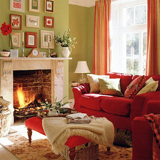 |
| Complimentary colors Red & Green |
This is traditional living room is a perfect example of a complimentary color scheme, using a near pure red hue on the furniture and a saturated green on the walls. The neutral colors of the fireplace and the flooring keeps it earthy and inviting.
 |
| Yellow ~ Green ~ Blue Analogous scheme |
Using three colors located next to each other on the color wheel, this analogous scheme mixes yellows, greens and blues in this eclectic and cheerful sitting room. The dark floors and furniture ground the design. As I mentioned earlier, the best way to make this scheme successful is to select one main color; tones of yellow in this case and use the other two colors as accents.
 |
| Triadic color scheme Purple~Orange~green |
Full of energy and fun! This room is not for the faint of heart; the green paint chosen for the wall is very bold, but in combination with the purple sofa and orange cushions it works, and that is the beauty of learning how to use the color wheel. There is a formula that if executed correctly is a winning combination.
I hope you enjoyed my post and as a result are a little more confident about choosing color for your home.
Will you commit to color?
~D~
For questions on this post or to hire Dionne Designs for your home email dionnetrifirodesignllc@gmail.com


